
The overview is probably the most important paragraph in the whole essay. In fact, as we will see later in this post, it is very difficult to score 7 or over without a good one.
An overview is simply a summary of the main or most important points in a graph, chart, process or map. It is normally 2-3 sentences long and should be the second paragraph you write in your essay. As we will see below, it also influences what you write in the rest of your essay.
Learn how to write a good one and you are much more likely to get a high score.
What does the examiner want?
An overview is one of the first things an examiner looks for because it shows them that you can identify the most important information from the graph or chart and clearly identify overall trends and comparisons.
If we look at the official marking scheme we can see that the word ‘overview’ is mentioned three times:
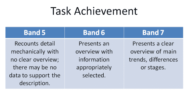
This means that to get at least a 5 for task achievement we must give some kind of overview. If we do not give any overview we will always get below a 5. If we select the appropriate data to include in our overview we get a score of 6 and if it is ‘clear’ we get a 7 for this part of the exam.
If you know how to select the appropriate data and you practice writing a clear overview, then you are likely to get the score you deserve in this section.
What is an overview?
To understand this we must look at the question. The question for academic task one is always the same:
Summarise the information by selecting and reporting the main features, and make comparisons where relevant.
We therefore need to provide a short summary of the main features. You do this in the overview paragraph by picking out 3-4 of the most significant things you can see and writing them in general terms. By general, I mean you do not support anything you see with data from the graph or chart, just write about what you can see visually.
Let’s look at an example:
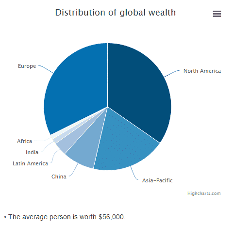
Overall, I notice that there are 7 regions. Europe, Asia-Pacific and North America make up the majority, with North America being the largest. Africa, India, Latin America and China make up a very small proportion.
We can then include these things in an overview paragraph:
The pie chart is comprised of 7 regions in total with Europe, Asia-Pacific and North America making up the vast majority of global wealth. North America has the single biggest share and Africa, India, Latin America and China combined, only make up a small proportion.
As you can see, I have not talked about individual fractions or percentages, in fact I have not supported any of my features with data. Instead, I have just reported what I can see visually, without looking closely at the data. If you have to look at the data, then you probably won’t write a good overview.
How do I select the correct features?
To understand this we have to think about the different types of graphs and charts we might see. There are generally two different kinds of charts and graphs: dynamic and static.
Dynamic charts show data over time and static charts show data at just one point in time. This will affect the type of data we select.
Let’s look at a dynamic chart:
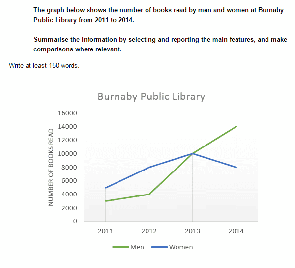
As you can see, the graph is dynamic because it shows data over a period of time. We should therefore look at the general trend over the time period.
First, we should look at what happened from the start (2011) to the end (2014). From the start to the end both lines increased. Then we should look at any other general trends for each of the two lines. We can see the blue line (women) goes up until 2013 and then does down a little. The green line (men) goes up slightly and then has a very large increase between 2012 and 2014.
These are the most striking or most obvious things we can see when first looking at the graph and these are perfect for our overview.
Let’s put this information into a sentence:
Over the entire time period the number of men and women reading books increased. Women saw a steady increase between 2011 and 2013 before declining in 2014, while men increased gradually at first before rocketing up in the last two years.
When we are looking at dynamic graphs we should be looking out for:
- What does the data do from the start to the finish?
- Do they generally go up or down or do they fluctuate?
- Any significant difference from the general trend?
- Overall increase/decrease?
- Peaks/lows?
No let’s look at a static chart:
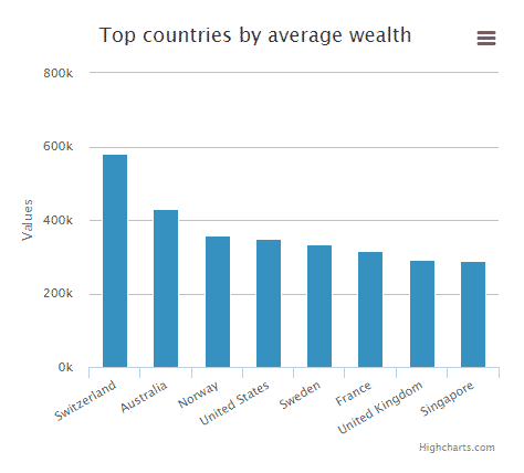
This chart is different from the last one because there are no dates to look at; it is data from just one point in time. We can therefore not talk about general trends over time.
Instead we are more concerned about comparing the data between the different sources. In this case, we will be comparing the data between countries.
The first thing I notice is that all countries are below 400k except two of them. Switzerland and Australia are the biggest and Singapore and the U.K. are the smallest. Switzerland has almost double the average. There isn’t a significant amount of difference between the bottom 6 countries.
Let’s try and turn the things I’ve noticed above into an overview:
The graph compares eight countries with only a small amount of difference between the bottom 6. Australia and Switzerland have the highest average wealth, with Switzerland averaging nearly double the value of the two bottom countries.
When we look at static graphs we should be looking for:
- What are the highest/lowest values?
- What are the most noticeable differences?
- Any similarities?
- Any significant exceptions?
Is there any special grammar?
You should try and make a complex sentence by making a subordinate clause. Complex sentences are sentences with more than one clause and they help increase our marks in the grammatical range part of the marking criteria.
You can easily make a subordinate clause structure in the overview by joining two pieces of information with the words ‘while’. ‘although’, ‘with’, ‘even though’, ‘whereas’ or ‘and’. However, make sure you know the meaning of these words and how they are correctly used in a sentence.
How does an overview fit into the rest of my essay?
The overview should be the second paragraph of a four paragraph structure:
Paragraph 1- Paraphrase Sentence
Paragraph 2- Overview
Paragraph 3- Details
Paragraph 4- Details
I tell my students to write the overview before the details because it makes it clear to the examiner that you have identified the main features and it also helps you write the details paragraph. In the details paragraphs you will simply take the statements you made in the overview and support them with data.
Shouldn’t I write a conclusion?
No. Conclusions are really a summary of what you think or opinions. This is not an opinion essay and you therefore do not need to write a conclusion. Save your conclusions for task 2.
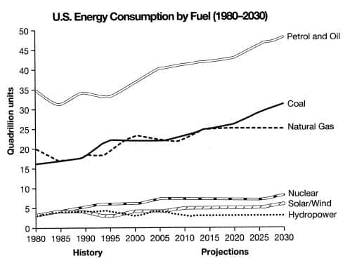
Example
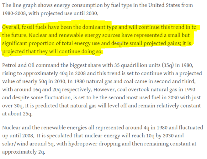
Below is one final example following the structure I used above. I have highlighted the overview in yellow.
Notice how I have picked out the most significant/noticeable/important features and talked about them very generally in the overview. I have not used any data in the overview. However, I have taken the features from the overview and supported them with data in paragraphs 3 and4.
I hope you found this post useful and if you have any questions please let me know in the comments section below.
Follow our Page on Facebook www.facebook.com/GrowSkills
Join our Official Groups on Facebook
- www.facebook.com/groups/Way2IELTSTOEFL
- www.facebook.com/groups/Way2GREGMAT
- www.facebook.com/groups/PTEAcademicTest
- www.facebook.com/groups/Engleze
GrowSkills | Educational & Language Testing Institute
www.GrowSkills.co.uk - www.GrowSkills.org
GrowSkills | Educational & Language Testing Institute
IESOL - ISESOL